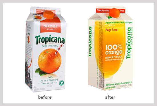
But sometimes even the big brands failure. Let's look at the rebranding of orange juice Tropicana. The professional marketing media wrote a lot about this when, despite of an expensive advertising campaign, company lost 30 million euros for two months of sales of juice in the new packaging. No wonder they had to give up innovation. By itself, the juice is not changed and the taste has remained the same. It was the brand that became different.
New packaging looked even more modern (which confirmed market research) and might be better to decorate the table for breakfast customers, but in terms of the recognition it has changed too: orange with a straw stuck in a glass has been replaced, the text typed in a different font, all the elements moved to another place. Orange and shape of the logo have a high diagnostic value for the recognition of the product. After the changing, their instantaneous automatic recognition has become virtually impossible, especially given the blurring of peripheral vision. During the rebranding and repackaging, it is necessary to remember what brand elements have high diagnostic value for its recognition. How to select them?
But not only the new design has become an obstacle to the recognition and purchase. The main visual signal on the new packaging - a glass of juice. How often do we see a similar picture in the daily life? Not that much. It is unlikely that most families have these glasses on a table during breakfast. In what families such a glass could stand on a table during breakfast? In a rather wealthy and prosperous. All other people are drinking juice from such dishes only when staying in a hotel or invited guests. All these promises activate idea of the particular case, therefore, the juice seems suitable for such situations only.
Now look at the original design. Oranges tell us not only about the oranges. You see the leaves? What are you talking about? The leaves are stored only on the freshly picked fruit. It conjures up the freshness, to which, by the way, glass is irrelevant. Of course, the juice may be fresh even in the glass, but the packaging of this says nothing. What is associated with a straw? There is not a stylish cocktail straw inserted in the orange, but a cheerful striped, which is usually given to children – a straw for everyday use. It turns out that the new design radically changed all existing views.
The goal was to emphasize the high class juice, and it was reached. But were the new ideas embedded in the packaging for the purchase? No, and that resulted in a strong decrease in sales.
From 'Decoded. The Science behind Why We Buy' book by Phil Barden


